

Back in July, we added foldable iPhone support to our goals for MealPrepPro.
The interesting challenge with iPhone Duo is that the screen can change while you’re using the app. You might open a recipe on the outer display, unfold the phone, rotate it, or resize the app.
Throughout all of that, you should still be looking at the same recipe. Your place in the app should stay intact. The interface needs to adjust without making you feel like you’ve started over.
The work started by making changes to our app startup code.
One app, many sizes
MealPrepPro has grown over almost nine years. Along the way, we’ve built layouts for different devices, added features, and made use of the space available on each screen.
Duo pushed us to revisit those decisions.
We turned to Claude’s recently added Design in Codebase feature. In earlier iterations of Claude Design we found it would often ignore the need to adapt designs for different screens.
Giving it the context of our code was a big breakthrough in terms of the quality of the designs we were getting back.
We started thinking about the elements of the page as “widgets” that would move around based on the space available.
Some screens were good to go - mostly where we’d stuck to Apple’s defaults (such as the settings screen) but other screens required much more work like the recipe view.
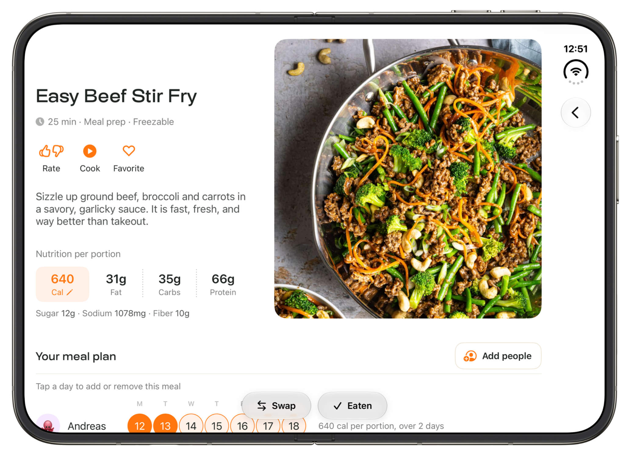
In the recipe view, we redesigned the nutritional information section and made it more compact so it could fit neatly beneath the recipe intro.
This solved an issue of a lot of white space and it also responded to what we were hearing from users that they wanted calories and macros listed further up.
Cooking on the iPhone Duo
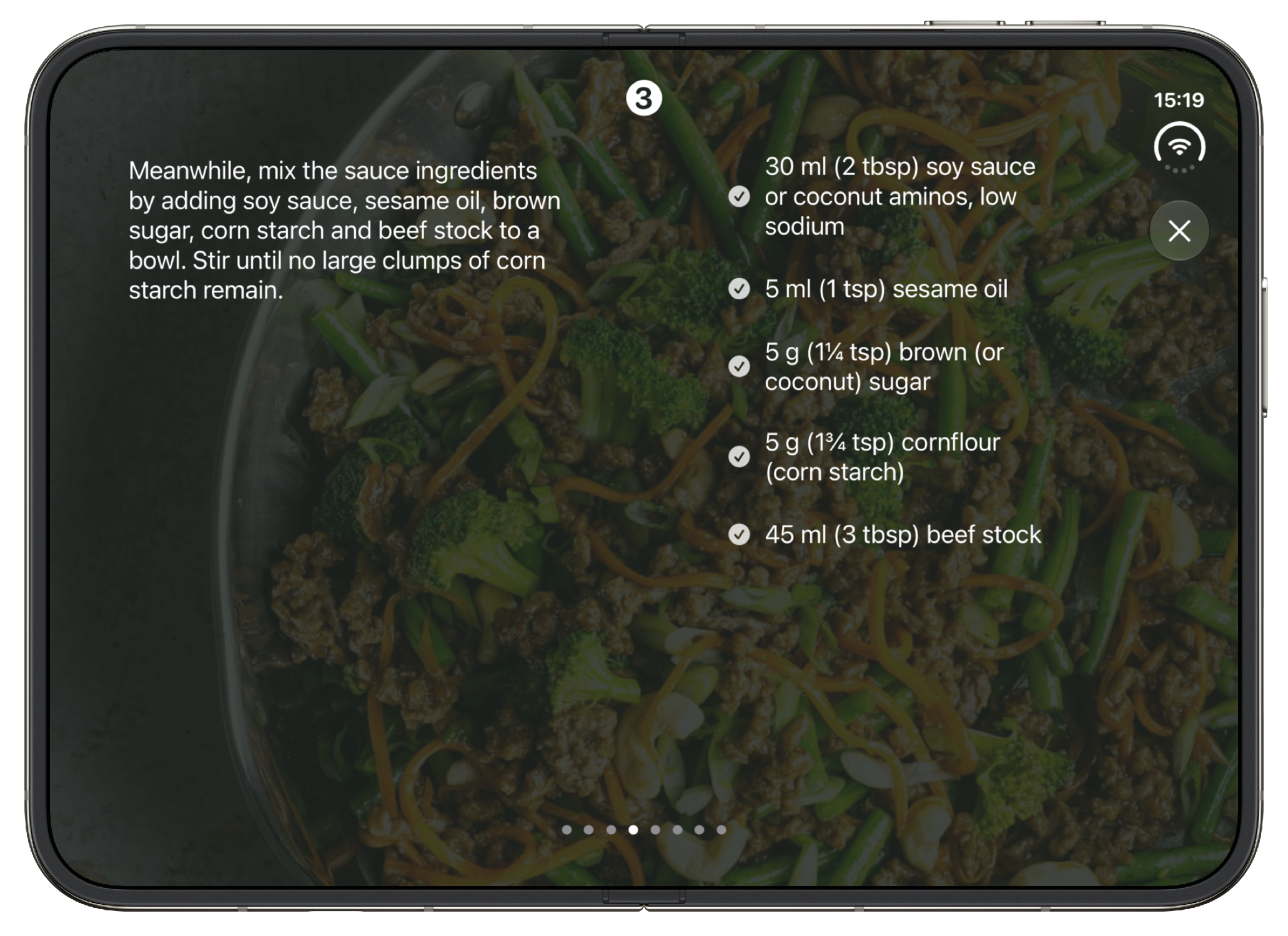
Cooking is a particularly interesting use case for Duo: a larger display gives ingredients and instructions room to sit alongside each other, so you can refer to both without constantly switching back and forth.
But a folding screen brings its own considerations. Controls need to remain easy to reach, and a button in the crease is hardly convenient when you’re halfway through making dinner.
Making it work, then making it feel right
By early October, we’d drawn a useful distinction between two stages of the work.
First, make the app resize and rotate properly. Keep content visible, preserve navigation, and use the available display without black borders.
Then, refine how each screen takes advantage of that space.
There are plenty of tempting possibilities for a device that can sit partially folded on a counter. But our first priority has been getting the adaptive foundation right, with more specialized layouts as something we’ve considered later in the project.
Tackling this with Claude available to us has definitely made us far more ambitious in what we’ve been able to do. It’s hard to imagine tackling a project like this in the pre-AI coding days.
Part of something bigger
I’m really excited for this update as it adds so many features and upgrades that we’ve repeatedly heard from customers.